Wednesday, 30 April 2014


STATEMENT


This project aimed to explore and create work that is influenced by death, be it in now outdated religious dogmas or personal reflections on how death affects us all and in different ways. Death is not the easiest topic to choose because a lot of different opinions are casted onto it; take the ‘skull’ for example, perhaps the most iconic relic of death. It can be an extreme image to some, downright morbid to others, while others still embrace it as a reminder of our own mortality, to choose life and live better for knowing that life is short so to make the most of it while we’re here.


 Mitchell Watson

Distortion

       Distortion (2014)  16 1/2 in. x 10 1/2 in.
vintage photographs, paint, ink, hessian, on canvas

Unmasking Heath

           Unmasking Heath (2014) 12 in. x 9 in. ( photograph 4 in. x 2 1/2 in.)
                     vintage photograph, paint, ink on canvas

Russian dolls

                                       Russian Dolls (2014)
5 in. x 3 in., 4 1/2 in. x 2 1/2 in., 3 in. x 2 in., 2 in. x 1 in., 1 in. x 1/2 in.
                             wooden nesting dolls, paint, ink

The killing moon

                 The Killing Moon (2014)  13 in. x 7 1/2 in.
     Wooden Box, Wood, twigs, paint, light bulb, paper,
                               skull beads, playdoh

Girl exposed

                        Girl Exposed (2014) 12 in. x 9 in.  paint and ink on canvas.

Hollowed out bible

 
                                            Hollowed Out Bible (2014)  5 1/2 in. x 4 in.
                                                 bible, skull beads, paper, ink

Hollowed out bible


                                         Hollowed Out Bible (2014) 5 1/2 in. x 3 1/2 in.
                                        19c. Bible, crucifix pendant, skull beads, paper

Hollowed out bible


           Hollowed Out Bible (2014) 5 1/2 in. x 3 1/2 in.
           19.c bible, skull beads, crucifix pendant, glue.

Hollowed out bible

 
                                             Hollowed out Bible (2014)  5 1/2 in. x 4 in.
                                19.c bible, skull beads, religious statue, ink, paint, clothing tag.

Consume or die

                        Consume Or Die (2014) 9 in. x 6 in.
 wooden box, paint, manikin head, Jean Paul Gautier aftershave bottle, comb.

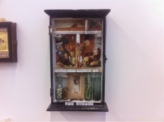
Christina's world's ending

                           Christina's World's Ending (2014) 13 in. x 7 1/2 in.
wooden box, various cut outs from well known paintings, paint, bottles, skullbeads,key,
                      bullet shrine, wire, ink, paper. vintage photograph.

Friday, 25 April 2014

The killing moon

  Wood, black paint, twigs, playdoh, skull beads, lightbulb, paper, religious statue


  A piece I made, painted predominately in black spray paint. I wanted to be more abstract. 

I used twigs to create a wood at night- they can be mysterious and haunting places and also isolated. 

Below the woods is the earth underneath with the roots connecting the two sections. I set the skull beads into the 'earth' to convey the dead as isolated, forgotten and many. Also as lonely. 

I used a lightbulb in part to convey the moon, it also has a eye on it which echoes Picasso's 'Guernica' in which 
an all seeing eye/ lightbulb is illuminating nothing - used in this case to symbolise our ignorance of our mortality. 

I also used a little religious statute to convey faith and hope that there is something after death- though it is tarnished by the paint as if the hope is fading. 

Louise Nevelson

  Sky cathedral, 1958, wood painted    black. 

In one of the art history lectures, Leila showed us some work by the artist Louise Nevelson. 

I found it really interesting how, the artist made all pieces in all black. They looked minimalist yet intricate. Assemblage and Abstract. And I remember hearing in the lecture that the artist said that black is a perfect colour, that encompasses all colours. 

you're really lovely, underneath it all


   After making and looking at the idea of revealing bones/ parts of people especially with 'girl exposed' I thought of Russian rolls, how the layers reveal another doll until the smallest one has been uncovered. 

Again, I wanted to be more light hearted and not make a dark macbre piece, 
What better than what is traditionally a children's toy? Also how I've spoken about mis conception and interpretations of death, a child's type thing seems quite apt as it strips it back to the basics. 

Revealing the person done to the skeleton and then the last doll being a doll, suggesting something after death whatever your belief. 

As I said about a traditional children's toy I wanted to simplify the depictions especially on the muscle layer doll and the skeleton, without being too graphic.

Unmasking Heath


From the previous piece of 'girl exposed' 
And the Elmo hood playing cards, I decided to take a similar path combing the two ideas to make this. 

I painted the 'skull' pink to create contrast with the sepia tones of the photograph and to make it look playful and more contemporary. 

Elmo hood

 
Elmo Hood is a London based artist whose art made out of playing cards is reasonably simple but intuitive and clever.

His use of playing cards has made me rethink how I can use the photographs I have to manipulate them and change them.

Girl exposed


  After creating the distorted photographs it made me feel that the defaced ones were exposing the untouched ones of not just death, but what's underneath. 

This led me to create this piece. Surreal, a girl lifting up the top half of her face as if tipping a cap to reveal her skull. 

I did this for a few reasons.

One, to show the mortality of us all underneath - sort of the beauty is skin deep saying. 

Two, to show the juxtaposition between life and death in a light hearted way.. I've felt as if some of my work has been a bit dark and wanted to break away from that for a bit - yellow background. 

Three, often in society we see women as objects, project sexual desires onto them 
And I felt making the woman not wear a lot of clothing - revealing quite a bust aswell - whilst revealing her skull creates 
a feeling that un veiling flesh is nothing unveiling what is within us is more important. 

Distortion


I created this by stitching together photographs and alternating them to create a distortion of the duality between life and death that all photographs are have frozen within them. Captured moments frozen in time. 
                      Detail.

                      Detail.

    The top photograph in the piece all the faces have been defaced with skulls. 
This was to represent that everyone will eventually die, I felt using family photos was apt to depict this. 

For the rest I mixed defaced photos with un defaced photos to convey the distortion. 

Compositions


Using different compositions of how to arrange the photographs. 

Also using photographs that I haven't drawn over fusing them with ones that I have - creating a distortion between life and death and also the duality of the two.

The bottom photograph above reminds me of the advertising billboards that turn to reveal different advertisements by the rotational properties of it. As if it was stuck between advertisements in a sort of frozen limbo that photographs sort of are, captured moments frozen in time.  

Monday, 17 March 2014

Consume or Die


Again, I'm trying to simplify my ideas. 
I made this one with the "consume or die" mantra in mind. 

I wanted to convey how we can sometimes put to much value on things that aren't really important that we buy into the consumerist ideals too much in life. 

I kept the box I made, white so the viewer is not distracted by what I wanted 
to show. I used a strip of yellow ( which can give a feeling of joy and hope to some people) and a strip of black ( can give a feeling of death or the unknown) to  create a juxtaposition between the two emotions. I also feel that it makes the sculpture stand out more. 

I used a Jean Paul Gaultier bottle in the shape of a muscular mans upper/middle body as I feel that it glorifies one of the consumerist ideas that if you wear this aftershave you will become more desirable like the bottle. I then painted the bottle (and used a manikin head for the skull) to create the skeleton and scratched into the paint with my finger nails making it less desirable as if the flaking paint is stripping away the 'beauty' to reveal ones true self that we will all become. Also the appearance of the distressed paint reminds me of body paint that has become wet revealing the true person underneath. 

I used a broken comb as 'wings' to emphasise that we almost idol worship our materlistic needs. If we buy things it will make us feel more complete (an angel being a symbol of divinity) 

Also I used the comb as I had bought it and probably paid too much for such a thing only to discover it had snapped in my bag one day. It reminds me to not buy such things that I don't really need myself. Also written across it was "lifestyle elegance" which I thought pretty much sums up what I'm trying to convey about putting that on such a thing as a comb. 

Neither one particularly appeals to me


  I tried to simplify this piece as the last piece I made could be considered 'busy' 

I used smiths lyrics again from the song 'nowhere fast' 

"I think about life and I think about death 
And neither one particularly appeals to me' 

"A fabulous line that describes how I feel sometimes. I may be bored with life but I certainly don't want to be dead. I think that line really sums up how apathetic one can get about life" 

That was a quote from 'All Men Have Secrets' that I felt really summed up how I feel about the lyrics I chose. 

I also used a bottle containing pills/vitamin tablets and skull heads to show the duality of the life and death line in the lyrics. 


    For this piece I tried to use more symbolism. I used images from various well known paintings with 'Christina's world' by Andrew Wyeth being split into three sections. The helpless woman in the vast field looks frail and appears to be facing towards the house. I put a wire 'fence' over that section to convey that that is no longer an option for her. The other section with the barn, I painted small grave stones to hint that this is the woman's only fate. 

Monday, 10 March 2014

The Essential Joseph Cornell


I got this book the other day "The Essential Joseph Cornell" by Ingrid Schaffner. I've yet to read it but looking through the pictures of his work really inspires me. Since my sculpture teacher recommended looking at his work after her seeing mine, I think I've found my 'favourite' artist. I love the 'found' materials that he uses and how he puts them together to create little scenes/worlds within boxes. Something seen as disposable and throwaway is transformed into wonderful works of art 


    Medici slot machine. 1942 stained hinged wood box with glass pane containing painted glass, metal jacks, photographs, printed papers, wood cubes, wrapped in printed and coloured metal, papers, glass and wood marbles, wood game pieces, mirrors, and compass mechanism. 
15 1/2 x 12 1/4 x 4/38" The Menil collection Houston. 

What I want to portray to the viewers


   In my studio space I put up some of the work I've been doing and put the smiths lyrics above it.

I used letters/words from out of a newspaper in the 'ransom note' style I did this to make the words appear anonymous, just like the long forgotten people in the photographs. 

In my drawing crit, a few of the group interpreted my work in different ways.
Some found it "creepy" others found it "humorous" while a few found it poignant and understood what I was trying to get across.

I fear that death as I've touched upon earlier that it is wide open to different interpretations. My lecturerer, when asked for my turn to say things about my work stated that I put my reasons across very well. Perhaps I should focus more on how I want to get my work across. 

The group also saw the bibles I've been working on and suggested that I could develop more of the photos " within boxes etc" 


    To display the bibles I decided to use glass plates so they can hang like picture frames.

Monday, 24 February 2014

The Man Who Came To Dinner (1942)

After discovering that the Smiths lyrics I were interested in were adapted from a scene in the 1942 film 'The Man Who Came For Dinner' I decided to find that scene and see if it gave the lyrics even more meaning.

After watched the scene I found the woman speaking spoke about visiting the world heritage site in Pompeii and seeing a preserved woman in which she recalls:

"All those people, all those lives, where are they now ? Here was a woman who once lived and loved, full of the same passions, fears, jealousies, hates. And what remains of it now ... I want to cry."

After watching the scene it has reaffirmed that the Smiths lyrics would be absolutely appropriate to accompany my work. 

Video link to the scene;
http://www.youtube.com/watch?v=NAJcP6x3Ueo&sns=em


Mozipedia


Having being a bit disappointed by "all men have secrets" book I looked in the book: 'Mozipedia: the encyclopedia of Morrissey and The Smiths'

I looked for the entry 'cemetry gates' which explains that curiously 'cemetry is spelt wrong which I myself didn't notice.

It said that the verse (I'm most interested in) 
" 'all those people' and ending 'I want to cry' is adapted from the screenplay of one of his favourite Bette Davis films,
THE MAN WHO CAME TO DINNER

'Passions just like mine'


I have a book ' The Smiths: All men have secrets' which is a sort of collection of memoirs by fans about the songs/lyrics  by The Smiths. 

In an earlier post I mentioned how lyrics from the song 'Cemetry Gates' by The Smiths could be used in my work/final piece. 

I looked at fans' memoirs about the song but was slightly disappointed to see that they didn't talk much about the lyrics but one entry was about visiting Oscar Wilde's (Wilde is heavely mentioned in the song) grave in Paris, France. And said that on the back of his gravestone " 'passions just like mine' daubed in Morrissey's honour"  

Those were the days, my friend...


carrying on from an earlier post about 'music' there's a song by Mary Hopkins which reached no. 1 in the uk, 1968 entitled 'those were the days' 

that I feel could accompany my work, the mood of the song envokes an old good ol' days nostalgia laced with melancholy. 
It also reminds me of New Orleans style funeral music with the jangly guitars and brass instruments playing. 
And the lyrics, especially the chorus: 

"Those were the days my friend
We thought they'd never end
We'd sing and dance forever and a day
We'd live the life we choose
We'd fight and never lose
For we were young and sure to have our way"


Link to a live recording of the song 
http://www.youtube.com/watch?v=kEG3iv0YKsw&sns=em

Studio practice


     A few more cdv's I've drawn on 

Wednesday, 19 February 2014

Hollowed out bible no. 4


With this one, I modified a little statue painting over the face, hands, feet giving it skeleton features. I was more influenced by the catacomb saints for this particular piece. Using a vibrant floral background (which was a clothes tag) and also the skull beads with paisley patterns on them. I was also influenced by Mexican religious folk art whilst making this.

Hollowed out bible no. 3


I'm trying to make each hollowed out bible piece original and individual while keeping them as an obvious collective. 

For this I used an orthodox icon in  brass with a card depicting mary and Jesus' face/hands being visible. I gave mary the skull characteristics that tie in with my CDV pieces. I chose not to do that to the baby Jesus depicted as I'm not intentionally trying to offend anyone (with him being the saviour to millions) and as told in the bible he's immortal anyway. 

Hollowed out bible no. 2


19 c. Pendant with skull beads.
I liked the frontis piece in this bible so I decided to work around it. I like how the sun sits directly above the crucifix as if offering enlightenment through death.

Hollowed out bible no. 1


I'm very pleased with how this piece came out. The crucifix is a 19 c. Pendant and the skulls are beads used for bracelets. I like how the hollowed out pages create an alcove like appearance reminiscent of the charnel houses. I think the bible accentuates the piece aswell and gives more meaning to the piece rather than using any old books. 

Charnel piece ideas


    sketch idea of a piece 

I've been thinking of making sculpture based pieces inspired by the charnel houses.

With the photographs I've been using being around the 19 c. I thought I could perhaps hollow out old bibles that I have from around the same era in which to make my pieces. 
I know some May not approve of "defacing"  bibles for religious reasons etc. But the way that I see it is these books are falling apart: I'm giving them a new life, an extended purpose. Also it emphasises the Christian inspired old holy practise of my work/research into the charnel houses and how they are within holy places. 


    19 c. And early 20 c. Bibles that I own.

Jean


On the Friday just gone I attended my great aunties' funeral where she was to be cremated. 

as the the final curtain was drawn one of her favourite songs played, a big band number I believe, which I found was a very fitting last song to a person's life.
Cheery but with a touch of melancholy as if a montage of memories should accompy the piece of music as it played. 

This got me thinking that perhaps my final piece could have music to accompy it. I'm not too sure at the moment if I want to have that but it's something to think about and could maybe offer the piece another dimension. 

With loves, and hates and passions just like mine.

The Smiths' song 'Cemetry Gates' 
Contains a good verse that I believe ties in with one of the points  I'm trying to get across to the viewer within my work 

"All those people, all those lives
Where are they now?
With loves, and hates
And passions just like mine
They were born
And then they lived
And then they died

It seems so unfair
I want to cry" 

In the song he talks about reading the gravestones in a cemetry and realising all these people who have long gone shared some common ground with him.


Link to song 

http://www.youtube.com/watch?v=knM7ow5vMPA&sns=em

Sunday, 16 February 2014

Photographs

        Partial section of photographs.

I bought over a 100 Victorian and early 20th c. Cabinet cards and CDV's.

Carrying on with adding skull characteristics over the faces, I think having a wall full of these photographs could make for an interesting piece.
I think the more photographs they are emphasises the inevitability of death and a humanistic side as all of these people were real people. 

Sunday, 2 February 2014

Seminar presentation

I've chosen to talk about a light hearted subject... Death.


"Mama always said dying was a part of life, I sure wish it wasn't"
- Forrest Gump

As a society we seem to be captivated by death, but very ignorant to it aswell.

Take the soap operas for example. Almost every Christmas there is a death in East Enders or Coronation Street etc. and just Soap Operas in general, It's a guaranteed way to boost the ratings.

 
More than 10 million people tuned in to itv on (21/01/14) as Hayley Cropper, sick with incurable pancreatic cancer, took an overdose with drugs and died in the arms of her loving husband Roy. Some praised the storyline for its sensitive handling of illness and death but others said it risked  encouraging suicides. 

Everyone dies, it's one of the indisputable   facts in this world,

"In this world nothing can be said to be certain, except death and taxes."
- Benjamin Franklin  

It's a subject we see everywhere, on tv and in films, in popular culture and in the newspapers. It's a thing that happens every day but it's also a topic we rarely discuss with one another.
It was Oscar Wilde who once said: 

'Life is far too important a thing ever to talk seriously about.'

And maybe that goes for death as well... 
I'm not saying that it's something we should discuss every morning over our bowls of corn flakes, but it is something we should discuss with one another more openly. Although, as death is a very subjective thing it can vary from person to person I.e in their beliefs, personal experiences: such as losing a loved one.

I'm researching this topic in my self directed work and I've come across quite a bit of misunderstanding and readily dismissal from some without listening to why I've done the practises I've done and the things I've researched. 

Take the charnel houses situated throughout Europe and the "catacomb saints" 

I've been looking at two books by critically acclaimed author and photographer Paul Koudanaris:

The Empire Of Death ( A Cultural History Of Ossuaries And Charnel Houses) 


Heavenly Bodies
(Cult Treasures & Spectacular Saints From The Catacombs) 


Here are some photographs from the books; I won't list all the details but the so called " catacomb saints" are mostly situated in German speaking regions of Europe and came about from Rome after the Protestant reformation in which saw a vast array of catholic relics destroyed. Known as "catacomb saints" because under a vineyard (Bartolomeo Sanchez, Italy) in 1578  a vast labyrinth of underground cemeteries were rediscovered and believed by the church to contain early Christian martyrs. 


    Most were decorated by nuns in Rome 


 Here is an extract from the Empire of death;
"To understand the great charnel houses we must first acknowledge that death itself is not a fixed concept. The French sociologist Jean Baudrillard, one of the greatest cultural theorists of the modern era, defined death as being simply the line of demarcation that separates the dead from the living. Within that axiomatic statement is an important implication: the line can be fluid. The process of living inevitably brings the cessation of life, but death as a concept is an intellectual construction that can vary from society to society and era to era." 

                                                       
                                                                   EVALUATION

I think I touched on some interesting topics such as death in pop culture and the media, it was a bit hard to seamlessly go from that transition to the charnel houses etc. and this showed in the presentation, it didn't go as well as it could've for these reasons. next time I will make a presentation that's more inter connected and flows easily.